top of page

Entergy Rebranded Marketplace

old Entergy ecommerce website selling items such as light bulbs, showerheads, faucet aerators and smart thermostats. The website looks dated using a logo that doesn't not match the branding colors and a featured products cards underneath a large banner image
The updated Entergy ecommerce website with coordinating branding elements. The website features the product categories underneath a large banner image. To the left of the website image features a short video of the website on an iphone in dark mode that scrolls through the home page and then through a product page of a smart thermostat.

The utility company, Entergy, underwent a significant brand transformation. My responsibility was to develop a new UI design system and revamp their eCommerce website in line with the updated brand guidelines.

Creating A Design System

Although the client's brand guidelines were comprehensive, they weren't designed specifically for an eCommerce site. My responsibility was to interpret these guidelines and develop new components and patterns tailored for the eCommerce experience. This involved creating UI components and patterns for category headers, product cards, and cart interfaces that aligned with the existing Entergy brand.

a color pallette featuring swatches of pinks, reds, bright purple, gray and black colors
screen with specifics about the brand typesface, header, body and button text
a screen showing various button designs to use throughout the website
a screen showing the light and dark mode versions of the website's headers with a grid overlaid on top for layout guidance
The product details page for a smart thermostat featuring some alternative product images, a short product description, the energy star logo and an add to cart and item quantity toggle interface.
The product category screen for smart thermostat featuring a large banner image of a happy woman adjusting her thermostat on a wall. Below the banner image is a row of smart thermostat product cards.

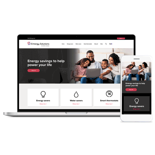
Designing for Dark and Mobile

In addition to creating responsive templates for various screen sizes, I also implemented a dark mode for the rebranded website. This required a careful balance between adhering to brand standards and meeting accessibility color contrast guidelines. By utilizing W3 color contrast tools and developing specific style guides for the software engineers to follow, I successfully delivered an accessible website in both light and dark modes while preserving the Entergy brand identity.

The homepage with a light gray and white background with contrasting button and text colors.
The homepage with a dark gray and black backgrounds with contrasting button and text colors.

Success Delivered to the Client

Entergy's brand new website was well received with minimal intervention from the client. They continue to deliver energy efficient solutions to 3 million customers to lower their electric and gas consumption. 

bottom of page